In the fast-evolving landscape of digital technology, ensuring that your website is responsive across different screen resolutions is not just a good practice but a necessity. With the increasing variety of devices, from laptops and tablets to smartphones and smartwatches, each having its unique screen specifications, it’s crucial to adapt your website design accordingly. This article explores effective solutions to test your website at various screen resolutions, ensuring optimal user experience and improved search engine rankings.
Dev Tools: A Developer’s Best Friend
Google Chrome, Safari, Microsoft Edge, and Mozilla Firefox
Embracing the need for responsive websites, major browsers like Google Chrome, Safari, Microsoft Edge, and Mozilla Firefox have integrated Developer Tools (Dev Tools) to simplify testing. To initiate the process, right-click on any part of the website, select ‘Inspect’ from the dropdown list, and launch Dev Tools along with the emulator.
For Google Chrome and Microsoft Edge, the emulator opens directly. Choose the desired screen resolution or opt for predefined resolutions. Additionally, customize resolutions for new devices and save them for future use.
Mozilla Firefox, however, requires an extra step. After launching Dev Tools, locate the mobile and tablet icon, or press ctrl+shift+M to activate the emulator.
Safari users should follow a slightly different route. Navigate to ‘Preferences’ -> ‘Advanced,’ enable ‘Show Develop menu in menu bar,’ and access ‘Enter Responsive Design Mode’ under the ‘Develop’ menu.

BrowserStack: Real Devices, Real Testing
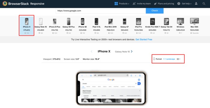
While Dev Tools provide emulation, testing on real devices can elevate the assurance of your website’s responsiveness. However, obtaining every device for testing might not be practical. Enter BrowserStack, a cloud-based platform facilitating testing on real devices and enhancing cross-browser functionalities.
As a top-tier mobile testing solution, BrowserStack stands out, offering a comprehensive approach to ensure your website performs seamlessly across diverse devices and browsers.
Beyond the Norm: Unconventional Screen Resolutions
As technology advances, traditional screen sizes like 1920×1080 and 1366×768 are no longer the only norms. Users are transitioning to desktop monitors and laptops with 2K & 4K resolutions. Additionally, the emergence of 16:10 aspect ratio displays introduces new challenges.
Consider the touch aspect, as mobile devices and even some laptops feature touch screens. Designing websites to accommodate touch input ensures future-proofing against evolving user interfaces.
Conclusion
In the era of multi-device usage, a responsive website is paramount for user satisfaction and search engine visibility. Utilizing Dev Tools for emulation and BrowserStack for real device testing equips developers with the tools needed to create a seamless, responsive design. Embrace the diversity of screen resolutions, including unconventional sizes and touch interfaces, to stay ahead in the ever-evolving digital landscape. Stay responsive, stay relevant.


